I still remember the day I realized that my cluttered desk was a reflection of my cluttered mind. As I began to _simplify my space_, I noticed a profound impact on my mental well-being. This experience led me to explore the concept of using color psychology to create a peaceful room, and I was amazed by the power of colors to calm the chaos within. By applying the principles of color psychology, we can transform our homes into sanctuaries that nurture our minds and souls.
In this article, I promise to share _practical advice_ on how to harness the power of color psychology to create a peaceful room. You’ll learn how to choose the right colors to promote relaxation, reduce stress, and improve your overall mood. I’ll guide you through a step-by-step process to _transform your space_ into a haven of calmness, using simple yet effective techniques that have worked for my clients and me. By the end of this article, you’ll be equipped with the knowledge to create a peaceful room that reflects your inner serenity and promotes a sense of well-being.
Table of Contents
Guide Overview: What You'll Need
Total Time: 1 hour 15 minutes
Estimated Cost: $20 – $100
Difficulty Level: Easy
Tools Required
- Color Wheel (for selecting harmonious colors)
- Paint Swatches (for testing colors on walls)
Supplies & Materials
- Calming Paint Colors (such as light blue, pale green, or beige)
- Soft Lighting Fixtures (e.g., table lamps or floor lamps with warm-toned shades)
- Comforting Textiles (e.g., plush throw blankets, pillows in soothing colors)
Step-by-Step Instructions
- 1. To begin our journey to a peaceful room, let’s start by understanding the power of color and how it can influence our mood and emotions. Consider the colors that make you feel calm and serene, and think about how you can incorporate them into your space. Perhaps you’ve always been drawn to the soothing effects of blue or the warmth of beige – whatever your preference, we’ll work with it to create a sanctuary that feels like you.
- 2. Next, take a step back and assess your room’s current state. Notice the colors that already exist, from the walls to the furniture, and think about how they make you feel. Are there any colors that clash or create a sense of discomfort? Make a mental note of these, as we’ll address them later in our process. Remember, the goal is to create a space that feels like a breath of fresh air, so be honest with yourself about what’s working and what’s not.
- 3. Now, let’s talk about the 60-30-10 rule, a simple principle that can help you balance your color palette. Allocate 60% of your room to a dominant color, 30% to a secondary color, and 10% to an accent color. This will create a sense of harmony and visual flow, making it easier to relax in your space. For example, if you choose a soothing blue as your dominant color, you could use a creamy white as your secondary color and a warm wood tone as your accent.
- 4. With your color palette in mind, it’s time to consider the lighting in your room. Lighting can greatly impact the ambiance of a space, and when combined with color, it can create a truly immersive experience. Think about the types of light fixtures you can use to enhance your color scheme – table lamps, floor lamps, or string lights can all add a touch of warmth and coziness to your space.
- 5. As we move forward, let’s not forget about the emotional connection we have with certain colors. Perhaps you have a favorite childhood blanket or a piece of artwork that evokes a sense of calm – incorporate these elements into your space to create a sense of personal connection. This will help you feel more attached to your room and more likely to relax in it.
- 6. Now, let’s get practical and start painting and decorating. Choose a wall or a piece of furniture to paint with your dominant color, and see how it transforms the space. Don’t be afraid to experiment and try out different shades or combinations – this is a process, and it’s okay to make mistakes. Remember, the goal is to create a space that feels like a reflection of your inner self, so trust your instincts and have fun with it.
- 7. As you continue to work on your space, take a step back regularly to evaluate your progress. Ask yourself how you feel in your room – do you feel more calm and relaxed? Are there any areas that still feel off or cluttered? Make adjustments as needed, and don’t be afraid to seek inspiration from nature, art, or other sources that bring you peace. By doing so, you’ll be creating a space that is truly your own sanctuary, a place where you can escape the stresses of everyday life and recharge.
Using Color Psychology
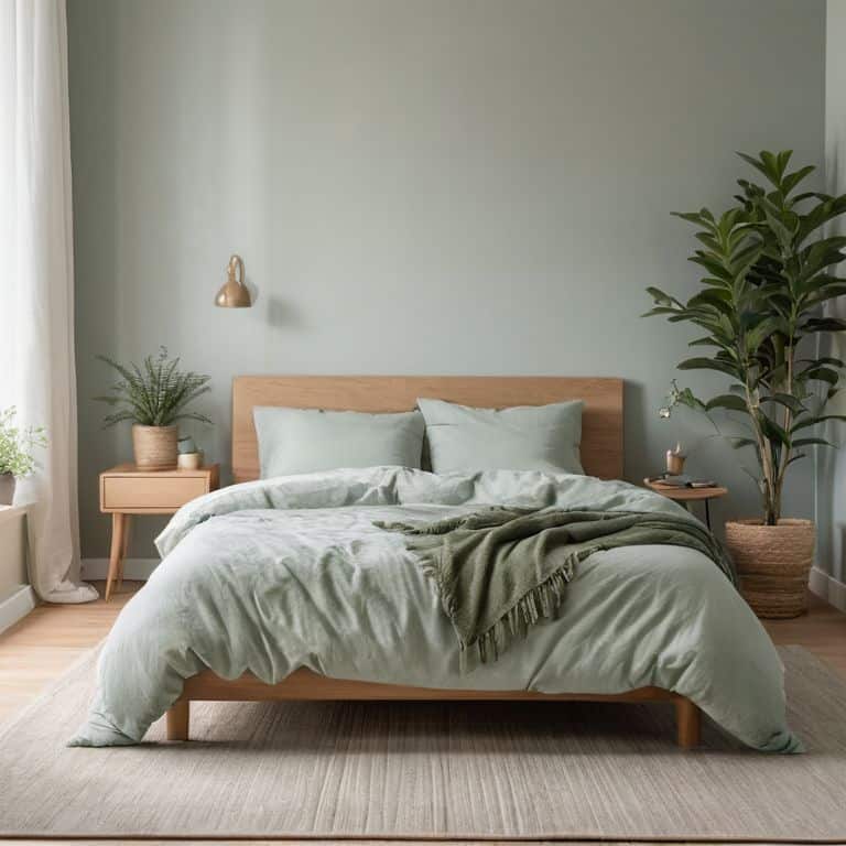
As we delve into the world of color psychology, it’s essential to consider the color palette for relaxation that will work best for your space. Soft hues such as light blue, pale green, and neutral tones can create a calming atmosphere, perfect for unwinding after a long day. I like to think of this process as “interviewing” the colors to see which ones will bring a sense of serenity to your sanctuary.
When selecting colors, it’s crucial to think about the effects of blue light on mood. While blue light from screens can interfere with sleep, softer blue tones in your decor can have a calming effect. For example, a green wall decor for calmness can bring a sense of balance and harmony to a room. By choosing the right colors, you can create a space that promotes relaxation and reduces stress.
To achieve a peaceful ambiance, consider adopting a neutral tone interior design. This approach allows you to add pops of color through furniture and decor, creating a sense of visual interest without overwhelming the senses. By doing so, you can minimize the psychological impact of bright colors and create a soothing atmosphere that calms the mind and promotes relaxation.
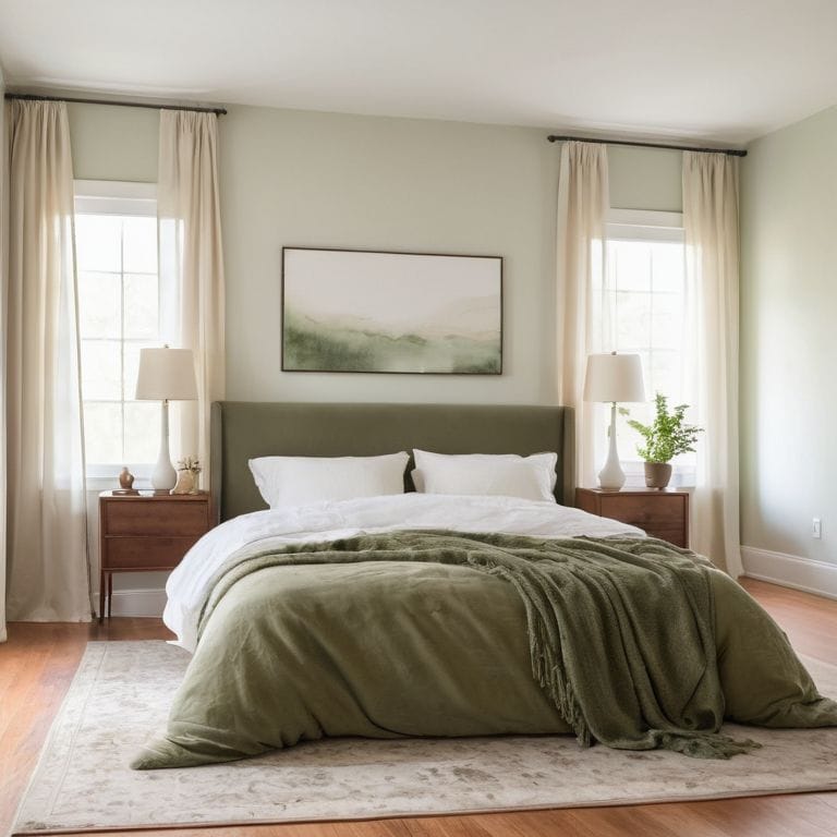
Neutral Tones for Inner Peace
Neutral tones such as beige, cream, and light gray can create a sense of serenity in a room. These calming colors can help quiet the mind and promote relaxation. By incorporating neutral tones into your color scheme, you can reduce visual stimulation and create a peaceful atmosphere. I often recommend using these tones for walls and larger surfaces, as they provide a clean canvas for adding pops of color through furniture and decor.
In my own home, I’ve found that neutral tones help me unwind after a long day. The subtle, soothing quality of these colors seems to melt away stress and anxiety, allowing me to focus on the present moment. By embracing neutral tones, you can create a sense of inner peace that permeates every aspect of your life.
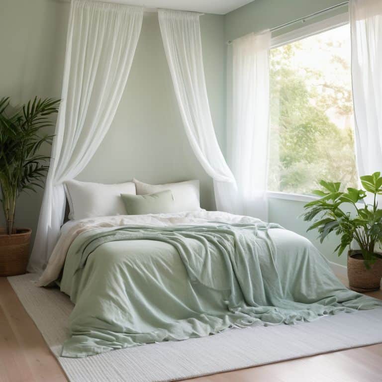
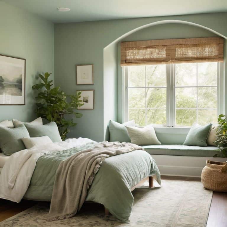
Sanctuary in Sight Calming Colors
As we delve into the world of color psychology, it’s fascinating to see how certain hues can calm the chaos within. Soft blues and pale greens, for instance, have a profound effect on our minds, evoking feelings of serenity and balance. These calming colors can be applied to various elements in our sanctuary, from walls and furniture to decorative accents and accessories. By incorporating these soothing shades, we can create a space that promotes relaxation and tranquility.
Consider the gentle warmth of beige or the soothing coolness of light gray – these colors can also contribute to a sense of calmness, making our sanctuary a true haven from the outside world. By thoughtfully selecting the colors that surround us, we can intentionally design a space that nurtures our well-being and calms our minds.
5 Serene Secrets: Bringing Balance with Color Psychology
- Choose colors that resonate with nature, such as soft greens or blues, to create a sense of harmony in your space
- Consider the 60-30-10 rule: 60% of the room in a neutral tone, 30% in a secondary color, and 10% in an accent color to maintain visual balance
- Select colors that promote relaxation, like lavender or light gray, for bedrooms and meditation areas to enhance their calming effects
- Apply the principle of color temperature: warm colors for cozy, inviting spaces and cool colors for calm, serene environments
- Experiment with monochromatic color schemes, using different shades of a single color, to create a sense of cohesion and visual flow in your peaceful sanctuary
Key Takeaways for a Peaceful Sanctuary
By applying the principles of color psychology, you can transform your space into a haven that calms your mind and nurtures your soul
Neutral tones such as beige, gray, and white can create a sense of serenity and inner peace, providing a clean canvas for your personal expression
Remember, the goal of using color psychology is not just to decorate your space, but to craft an environment that reflects your inner self and promotes emotional well-being
A Reflection of Serenity
As we intentionally select colors that soothe our souls, we’re not just designing a room, we’re crafting a sanctuary that whispers peace to our minds with every glance.
Nathan Reed
Creating Your Sanctuary: A Journey of Self-Discovery
As we’ve explored the world of color psychology together, I hope you’ve begun to see the potential for transformation in your own space. From the calming effects of blue to the soothing qualities of green, we’ve discussed how different hues can influence our mood and well-being. By applying these principles, you can create a room that not only looks beautiful but also feels like a true sanctuary. Remember, it’s all about finding the right balance and harmony that resonates with you, and using that to guide your design choices.
As you embark on this journey of creating your peaceful room, I want to leave you with a final thought: the process of designing your space is not just about aesthetics; it’s about cultivating inner peace. By taking the time to thoughtfully consider the colors and elements that bring you calm and serenity, you’re investing in your own well-being. So, take a deep breath, let your imagination run wild, and remember that every brushstroke, every furniture piece, and every decorative item is an opportunity to bring more serenity into your life.
Frequently Asked Questions
How can I balance my personal color preferences with the principles of color psychology to create a peaceful atmosphere?
To balance personal taste with color psychology, I recommend a ’60-30-10′ rule: 60% of the room features a calming, neutral tone, 30% a secondary color that resonates with you, and 10% a bold, personal accent color, allowing your personality to shine while maintaining serenity.
Are there any specific color combinations that are known to promote relaxation and reduce stress in a room?
For a truly serene atmosphere, consider pairing soft blues with creamy whites or muted greens with warm beiges. These calming color combinations can gently soothe the mind and reduce stress, creating a peaceful sanctuary that envelops you in tranquility the moment you enter.
Can the color psychology of a room be influenced by the natural light it receives, and if so, how can I adapt my color choices to work in harmony with it?
Natural light beautifully influences a room’s color psychology. Consider the direction your windows face: south-facing rooms can handle deeper colors, while north-facing ones benefit from lighter shades to counteract cooler tones. Observe how sunlight interacts with your space and adjust your palette to harmonize with its gentle dance.